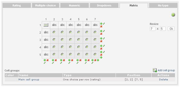
Edit matrix screen look like this:
Changing matrix size
You can at any time increase/descrease number for columns and rows in the matrix.
-
Delete row by clicking on the red cross icon for that row.
-
Delete column by clicking on the red cross icon for that column.
-
Insert row by clicking on the green plus icon. The row will be inserted before the row where you clicked on the icon.
-
Insert column by clicking on the green plus icon. The column will be inserted before the row where you clicked on the icon.
-
User resize matrix feature. Set number of columns and rows you want and click on the Ok button. New rows/columns will be added and existing columns and rows will be deleted from the end of the matrix to match the requested size.
Moving a cell
You can move position of the cell by one cell. Hold the mouse over the cell a couple of seconds and a little move cell window will appear. Click on the arrow to move the cell. NOTE: cells can be moved only within the same group type. For example you can't move cell of type Radio to a group of Checkboxes.
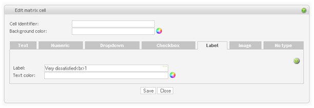
Changing a cell.
Click on the cell you want to change. A new window will open allowing you to enter the cell details. You can name the cell for better identification in the reports. The cell identifier is optional. You can also set the background of the cell.
There can be 8 types of matrix cells:
-
Empty cell Empty cell can be used when the cell does not need to carry any visible element. Most of the cells are empty when you first create a matrix question. Click on the Empty cell-button and set the type from the dialog window that appear. Empty cells do not have an identifier and background color.
-
Text Cell of type text allows respondents to enter any text in the field. "Field size" is the visible length of the fields, in characters.
Validation: Validate/check the answer from the respondent. It can be used to demand a specific type or length of answer from the respondent and set the appropriate error message if these requirements are not met.
-
Numeric Cell of type numeric restricting the answer to a number only. Select this type if you need calculations on the report (type text will only produce a comment listing). Numeric types available are integer or decimal.
NOTE: Use numeric type only for numbers you want statistic analysis for. For input like telephone numbers, credit cards and country zip codes, text type is recommended.
Validation: Use this to set restrictions for answers and error messages for invalid numbers, required input, and min/max values.
-
Dropdown Cell of type dropdown list are exactly the same as the usual dropdown list for the question types, except it can only have a single selection. You can either create a dropdown list directly, or create and load from the bank if you are to use it again later. See dropdown list question for more details.
-
Checkbox. The checkbox simply inserts a checkbox for your respondents to check. This is a true/false type answer.
-
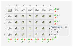
Radio button. Radio buttons can only be used/defined if it is grouped with other cells. See Cell groups below.
-
Label. Text to be displayed in the cell.
-
Image. Set image to be displayed in the cell. See the section called “Images”