To add an element, click "add element" from the report structure page.
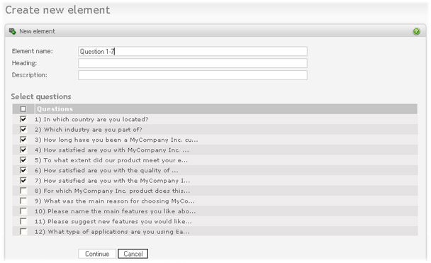
Enter a name, heading and description for the report element and the survey questions you want to include. Select continue to go to the next page.
On the next page you select the report types you want to apply to the questions you selected in this element. These are
-
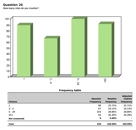
Summary report. Produces summary statistics for each question in the element. Example, with a chart:
-
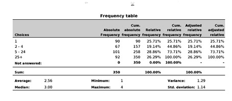
Detailed statistics. Produces detailed/in depth statistics for each question in the element. There is a difference in the frequency table when selecting this option. As you can see in the picture below the frequency table now includes columns for cumulative values. In addition, a set of statistical variables is included below the table.
Example, without chart:
-
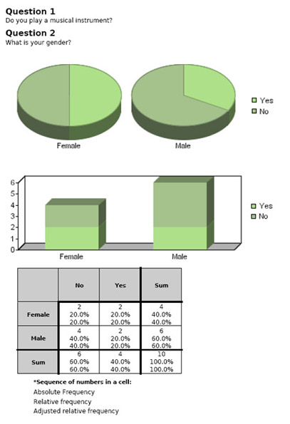
Cross tabulation. This is a comparison of two questions, including cross-calculation of frequencies of data for each. This applies only to questions that allows selection between items, not including the matrix question type. Take these multiple choice questions, for example: 1) Do you play an instrument? (with answer alternatives yes/no) 2) Your gender? (with answer alternatives male/female). Then, the report may look like this:
- Free text comments. If you have included "free text comment" boxes in your survey, this option will list the comments for the questions selected in the report element. Each of the answers will be listed along with the respondent id. That way you may also access individual results.
- Text in multiple 'other' fields. If you have included a text field for "other" in multiple choice, this option will list all the comments entered by the respondents for this field.
- In-text field texts. Check this option to show comment listing for in-text fields of type text.
- Text in matrix cells. Select option type if you want to list all the comments in the matrix cells of type text.
-
Chart types.
-
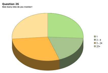
Piechart. Display summaries for each question (or in-text field, or matrix cell), if it applies, as a piechart. It may look like this:
-
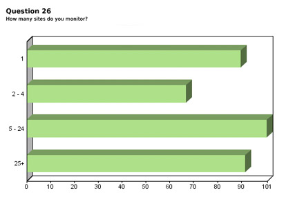
Horizontal barchart. Display summaries for each question (or in-text field, or matrix cell), if it applies, as a horizontal barchart. It may look like this:
-
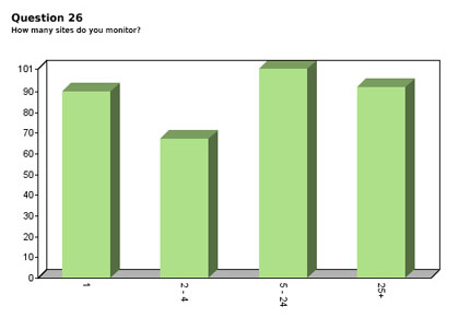
Vertical barchart. Display summaries for each question (or in-text field, or matrix cell), if it applies, as a vertical barchart. It may look like this:
-
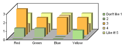
Vertical barchart with bars behind. Display summaries for each question (or in-text field, or matrix cell), if it applies, as a vertical barchart with bars behind. It may look like this:
-
-
Other.
- Show non-selected items. When selecting this option all items in a dropdown or a multiple option list will be included for the element, even though some of the items haven't been selected by the respondents.
- Numeric precision. The numeric precision of all numbers in the report element.